From Excel to Jupyter (with boxplots!)
Why Jupyter?
In my first job as a risk analyst, Excel was the go-to tool for analyzing data and building charts for technical reports. We would extract files from the central database, copy them into Excel files, do some data processing to build meaningful tables, and then we would use Excel’s predefined charts to create visualizations.
Excel is a pretty powerful tool and there are a lot of tasks where Excel is the right tool to use. However, in my data exploration and reporting tasks, I always ended-up missing some key functionality that would make my work much harder. On the top of the list was the ability to plot boxplots (I still get chills when I remember this…).
As a refresh, a boxplot is a standard chart for visualising distributions. Given a group of observations from a certain variable, it depicts the 25th, 50th and 75th percentiles as a box, and it depicts the maximum and minimum values (excluding outliers) as whiskers. The following figure shows an example:
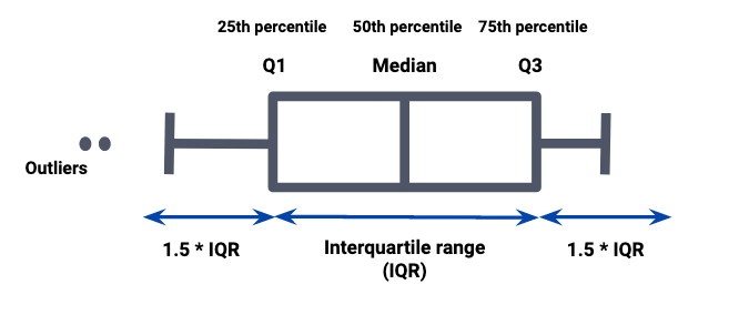
This chart is very useful to compare populations and was widely used in our technical reports. Unfortunately, Excel does not have the feature of building boxplots from raw data, and thus we had to do some gymnastics to build them. This included computing the needed percentiles and the maximum and minimum without outliers, doing some tricks to build the boxplot’s boxes as a staked bar chart and then color the bars individually to hide the bars that were “supporting” the boxes and to show the bars that made the boxes. Finally, we would add the whiskers by overlapping some lines of correct size on top of the staked bar chart.
It was an automation mess! And it was very prone to human errors. At the time, I started to wonder whether there was a better way. And there was! Data Science with Python was booming at the time and Jupyter Notebooks were being used ever more often to do data exploration and reporting. So, I dug into it and started to work with these tools, leaving my hacked boxplots time behind me.
With this post, I wish to motivate people that use mainly Excel for reporting and data exploration to broaden their horizons and try out JupyterLab and Jupyter Notebooks. It can be a learning curve, but one that is totally worth it on the long run.
As an illustrative example, we will read data from an Excel file with daily foreign exchanges rates between the US dollar and 22 currencies and build a boxplot to compare the exchange rates for the Scandinavian currencies. The data was downloaded from Kaggle and both the data and the final notebook and be consulted here.
Installing Anaconda and starting JupyterLab
Before starting to use JupyterLab, you need to have a python installation in our computer. The easiest way of doing this is to install Anaconda. Anaconda is an open-source distribution package for python and R that simplifies package management and installation. The main advantage is that because Anaconda has a focus on supporting Data Science work, it already comes with mist of the data exploration and plotting packages you’ll need.
In their page, they have step-by-step guides on how to install it, either for macOS or Windows. Make sure you download the Python 3.7 version.
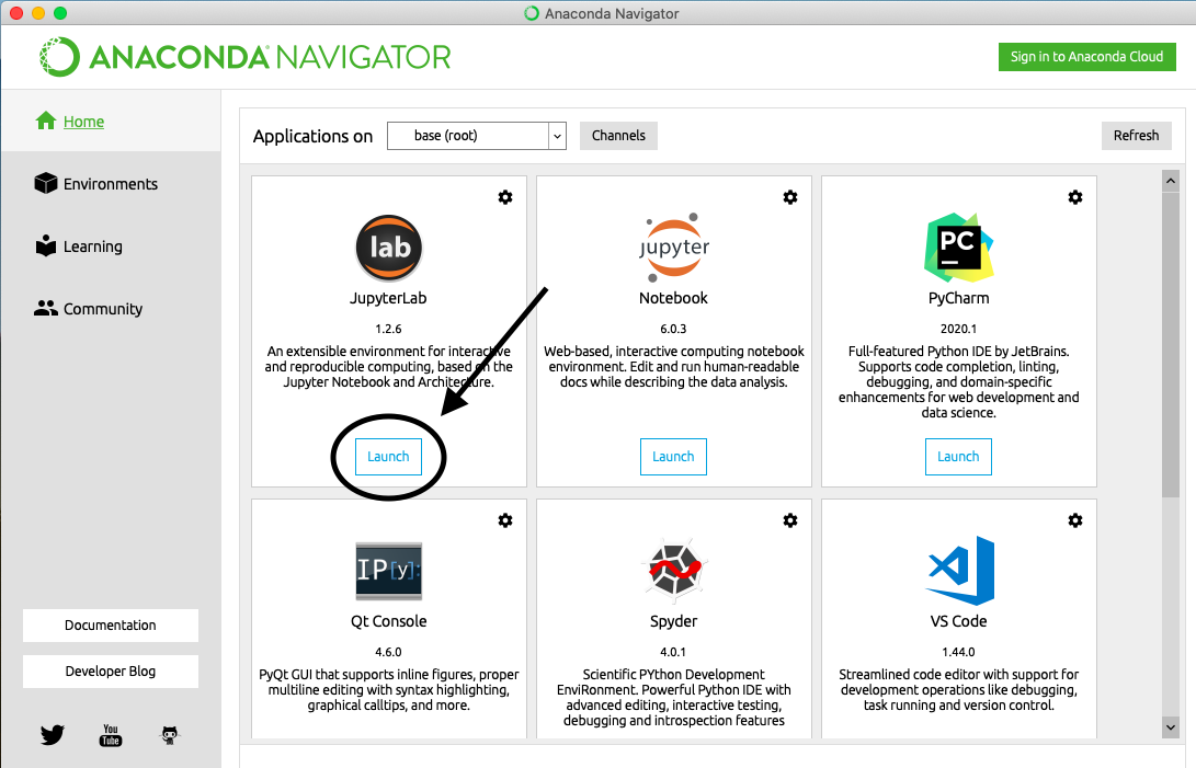
Once the installation is done, which can take some minutes, you can launch Anaconda. After the launch, you’ll see a screen with a grid of applications you can use. Launch the JupyterLab application by clicking on dedicated the button:
Anaconda will start JupyterLab and a new session will open in your default browser, and you’ll see JupyterLab’s home:
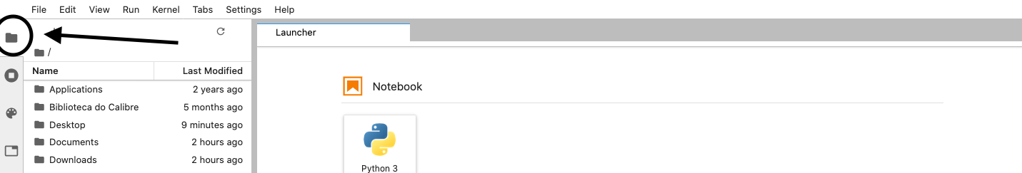
JupyterLab is simply a web-based interface to run your Jupyter Notebooks and manage your data and folders. If you click on the folder icon in the top-left, you will see your home directory:
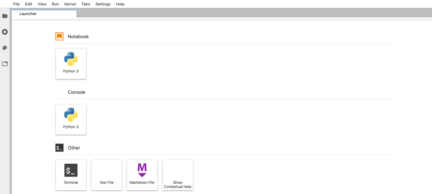
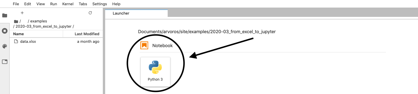
You can then navigate in these folders until you find the folder in which you want to work (i.e., where you want to save you Jupyter Notebooks and data). For this example, I have an Excel file with some data I want to analyse, and so I go to that directory and create a new notebook by clicking on Launcher:
And this is the result! A new clean notebook to start:
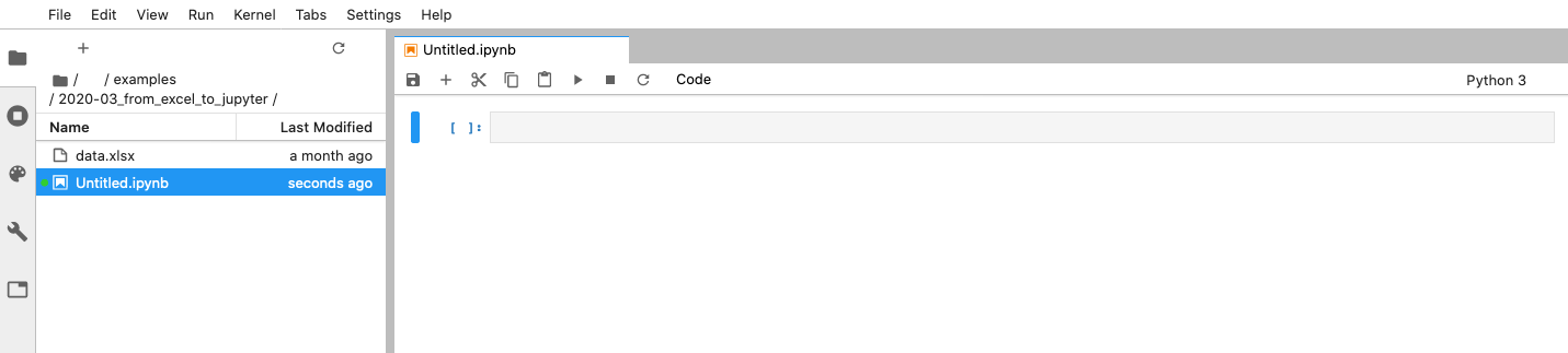
You can rename the notebook by clicking File -> Rename Notebook.
Using Jupyter Notebooks
Now that you have created your first notebook, I will quickly explain what are these notebooks and how they work. According to the Jupyter Project’s website:
The Jupyter Notebook is an open-source web application that allows you to create and share documents that contain live code, equations, visualizations and narrative text
In order words, with Jupyter notebook, we have human-readable documents where we can write rich text (such as text, figures, equations, etc.), run code and see its outputs directly in the notebook. This feature makes it a great tool for data exploration and reporting since we can process the data, build the visualizations and write the report all in one place!
Jupyter notebooks are saved with the .ipynb extension and are simply a sequence of cells saved in a special JSON format.
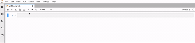
A cell is a multiline text input field and Jupyter has three main types - code cells, markdown cells, and raw cells. The
most important are the code cells, where you can write and execute code, and the markdown cells, where you can write the
rich text. Going into detail about Markdown is out of the scope of this post, however, if you want to know more, you
can check the Wikipedia page.
To execute a cell, either a code or markdown cell, you can simply use the keyboard shortcut Shift-Enter or use the Play bottom on the toolbar. By default, cells are code cells. However, you can change the cell’s type by using the drop-down menu of the toolbar. You can see bellow how to do this:
To know more about how to work with Jupyter Notebooks, I suggest Jupyter’s documentation.
Finally, before we move on to the part of importing the data and building a boxplot, we’ll need to import the necessary python packages to do these analyses. Thus, create a new code cell and run the following code:
|
|
This will import the 3 packages we’ll use until the end: pandas for reading and preparing the data and seaborn and
matplotlib for the visualization.
Loading and prepping the data with Pandas
Now we can use pandas to read the foreign exchange data from the Excel file. Recall that the data file in the same
directory as the notebook. If you don’t create the notebook in the same directory, you’ll need to change the path to
Excel file. pandas has an easy function to read Excel files, read_excel:
|
|
Create a new code cell and the code above. In the fist line, we are using pandas (which was imported as pd) to read
the Excel file. The variable data_df will store the pandas DataFrame that contains the data in the Excel file. DataFrames
are one of the most important structures in Pandas as they can be used to store tabular data. In short, a DataFrame is table
where each column is a single variable and each row is a data point. It has a direct translation to the columns and rows
in Excel.
Note that the Excel file with the foreign exchange rates had some cells with the string “ND” instead of number. These were the cases where the markets were closed and thus there is no quote for the exchange rates in that day. Because Excel represents null values in different ways, pandas gives us the option of specifying a list of strings that should be interpreted as a null value. In our case, we only had the “ND” string.
Then, we use the data_df.head() command to print the first 5 rows of the DataFrame:

One of the advantages of using notebooks with pandas is that you just need to print a pandas DataFrame and Jupyter will automatically format it in a nice table that you can easily investigate. Thus, with two lines of code you can import our data to pandas and have a quick view of it.
Now, we need to apply some transformations to the data in order to build the desired boxplot. The code is below:
|
|
Let’s analyze it step-by-step. We start by defining two lists, one with the columns we wish to keep (i.e. the three
Scandinavian currencies) and one with the column names we want to appear in the boxplot. Then we create a new DataFrame
named clean_data_df which is set as the original DataFrame data_df with only the three desired columns. With the fourth
code command, we change the column names and, in the final command, we unpivot the DataFrame from a wide to a long format.
In other words, in order to plot the boxplot with Seaborn, we need to have the exchange rates of all the currencies in a
single column (which will be named Rate) and one extra column indicating the currency (which will be named Currency).
After running this code, we get the following result:
And now, we are ready to build our boxplot!
Plotting with Seaborn
Since we already have our DataFrame in the correct format, where the exchange rates are in the column Rate and the
currency names are in the column Currency, we just need to use Seaborn’s function boxplot and indicate the name of the
column that should be used in the x-axis, the name of the column that should be used in the y-axis and the DataFrame that
should be used to populate the plot. Then we just need to run the matplotlib command plt.show() in order to print the plot:
|
|
After running these cells, you get the following output:
